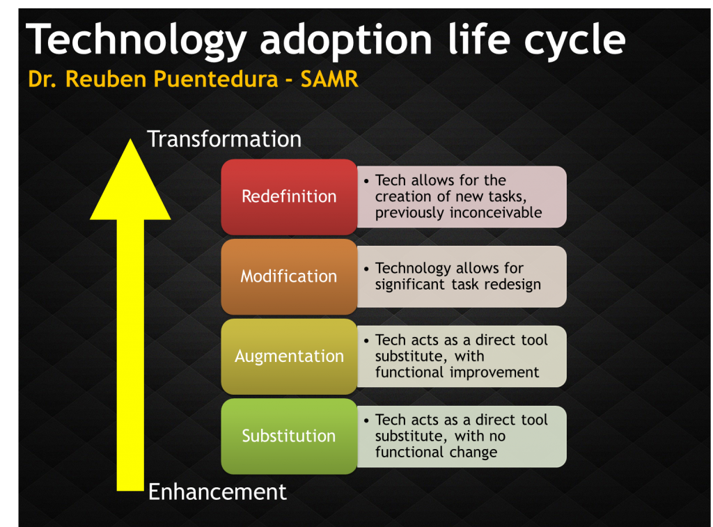
There’s been a fair bit of mention of the SAMR framework recently so I thought I’d share another rendition of the framework. I’ve always preferred looking at it in a vertical sense, moving upwards rather than a top down looking model. It makes more sense to me. What do you think?

I much prefer bottom up and SIMPLE! Have you seen Jeff Utecht’s SAMR circle?
I haven’t seen it no. Thank you. It’s a good thinking tool. Have you seen my #SAMR planning flow chart here? https://ictevangelist.com/tlab13-transforming-learning/
My challenge to this image is that color matters. What do the colors represent? We redigitized the image with meaningful color. https://twitter.com/smeech/status/261306206772133889
I also think it makes directional sense moving up.
I like how you’ve put them in to steps. Great! I updated it again recently to this: https://ictevangelist.com/wp-content/uploads/2013/06/Screen-Shot-2013-06-27-at-14.18.40.png which you might like too…