Infographics made, easier? Well – as you know I’m a big fan of representing information beautifully. It makes what you’re trying to explain easier to understand rather than looking at a massive bank of numbers. Representing data in this way, truly is turning it in to information – something ICT teachers often strive to pass on to our students. Having previously discussed infographics here and here I thought it about time I had a bit of a discussion about the site Infogr.am. Whilst it doesn’t give you as many options as the likes of Piktochart, it really does give you the opportunity to make simple infographics quickly and easily and is currently completely FREE. With a built in spreadsheet facility for you to enter data and automatic chart creation with a few charting options too, it really does present itself with some great options.
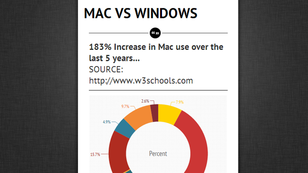
Here’s one I made earlier. Please note I made up some of the data! See if you can guess which (although you might agree!).
If you have any other infographic creators you use or know of that would work well in education, please let me know. I’d love to hear your feedback in the comments.
Cheers!


Hi Mark. I have just used Infogr.am with a class to create info grams about their future lives. Part if our Pebble project based learning course. It worked well and students produced some great results. The biggest hurdle for them was understanding the spreadsheets behind the data to put in their own data – a great test of their numeracy skills. One issue we found with the site was often photographs which were deleted kept reappearing in preview mode which we used to share their products for peer assessment.
Hi Paul
Great to hear! Our students found that too. It’s a bit annoying isn’t it. If it doesn’t improve I might switch to using Easelly which also works well but doesn’t have that annoyance.
Cheers
Mark
Do those Mac usage stats include iPads one muses. Wasn’t obvious from w3schools data but looking at the increase in Mac usage accelerate from a fairly stagnant position in 2009/2010 I would say it probably does coincide with the release of the original Apple Tablet device in April 2010.
I think there’s merit in your argument 😉 I was just using the stats as a vehicle to demonstrate the tool.