
I love a good wall display. It can make the room or corridor come alive. I know how hard however it has been for me to get sorted with decent wall displays. My first head of department helped me loads. As an art teacher he taught me lots about how to make the display really work. Another old colleague of mine, Kelly Hawkins, taught me a lot about how to make great displays too.
I do get a bit annoyed when I see wall displays that have no purpose. I often hear stories about wall displays going up just to satisfy the whim of leadership who are concerned for reasons other than learning. I don’t think spaces should be used up with posters for the sake of posters either. By all means have reminder posters for class rules, ethos indicator posters (although Carl Hendrick might disagree). I think it is important to have consistent messages in spaces across a school.
So, to help those who struggled like I have in the past, I thought I’d share some of the things that I’ve learned over the years to make wall displays look a bit more professional and to make life a bit easier for yourself too.
Content
First and foremost you should think about the purpose of your display which ultimately comes under the title on content. I do plan on writing a post about ‘working walls’ which are something slightly different to a display but there will be lots you can take from this post to inform what you do with your working walls.
You should think about what the purpose of the display is – is it for information to support learning in the classroom such as a ‘stuck wall’ or a ‘QR code wall with links to resources’? Is the display for sharing and celebrating student work?
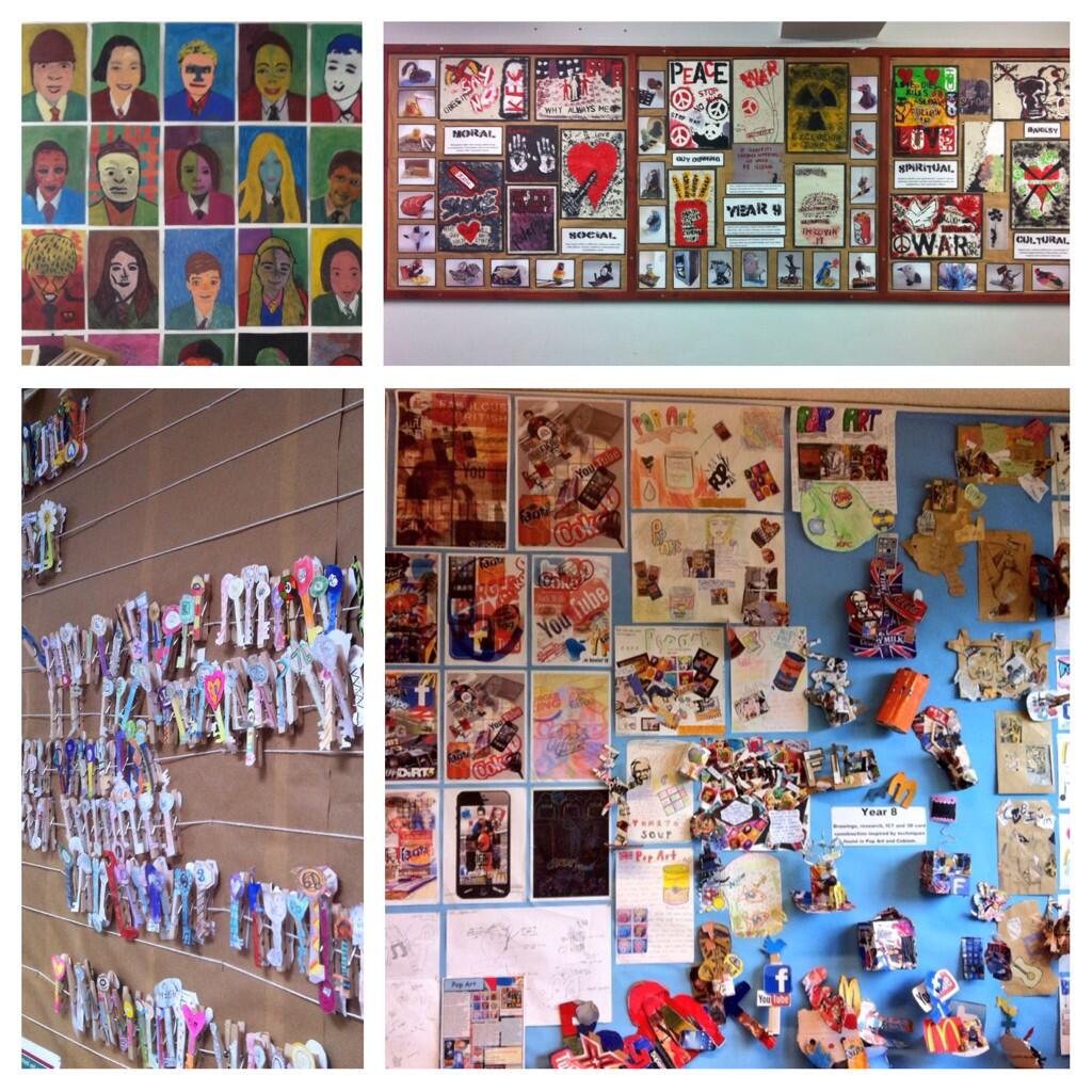
If it’s a display featuring student work, remember to include names of the children whose work you’re displaying. Remember too to include work by all of the students. All students need to know that their efforts are valued. The display should not represent just the ‘best’ work but work representative of the whole group and therefore hitting a wide ranging audience.
Display drafts of work against polished and finished pieces. This shows children that the process and struggle of learning is valued and what can be achieved with effort too. An earlier draft of a piece of work next to an improved and developed piece of work can show how much students have grown as part of the process.
A bit of student voice can help to foster the positive relationships that come from working with young people. Ask them what they want to see showcased in the room. Don’t do the displays just by yourself – engage in their help and assistance too. Getting students involved in what happens in the classroom helps to develop their sense of pride in the environment – it is their space too after all! That said, temper their choices against your judgement too. Whatever goes up in the classroom should enhance learning rather than distract from it!
A good time to think about the content that you can display in your room is when you are developing your schemes of learning. Try to include this in to your planning so that you can give yourself a roadmap for when you should be developing and refreshing the walls in your room / area.
Background
If your children have produced work on white paper, a black background will be particularly effective. Mounting pupil work can really make it stand out too. Use bright colours to make it really stand out and give contrast to the black background. More on mounting and colour later!
Border
A border is really important to draw in the pupil to the area in which you’re creating your display. It also provides a really effective way of hiding all of the various staples and pins you might have used in putting up the backing! For a really great look, try to use double sided sticky pads on the border to leave no staples or pins on display.
Lettering
I like to get letters for titles cut out and mounted to make them really stand out when they are stuck to the wall. There are various ways of doing this. If you are fortunate enough to have a reprographics department then often, they will be able to print out letters on specific coloured paper or card for them to be cut out too. For an extra lovely effect, mounting these on slightly bigger letters can make the title really stand out. For really cool lettering too, visit the website ‘da font‘ which is a great place to grab some really stylish and modern fonts. A great font for titles which is a) easy to cut out, b) looks great, c) is modern and d) is free, is ‘Chunk Five Ex’. You can download it for free here. What I do if possible is:
- type the letters in to a word processor the size that I want
- save it as a PDF (this is because the reprographics department will be unlikely to have your funky new font. PDF files compress the text into the document and therefore keeps the fonts in the PDF. If you send them a Word file, Word will not see your font and revert to a standard font. They will not thank you for cutting something out in Times New Roman only to find out you don’t want to use letters in that font!)
- email it to reprographics to do their magic with the lettering – if you can afford it and they have the time, remember to send a second version of the letters at a slightly larger size for them to mount the smaller letters on to.
If you don’t have access to a lovely reprographics team to do this for you, then you can do it yourself. Just make sure you a) have time, b) have a board upon which to do the cutting on – you don’t want to cut through and leave marks all over your desks in your classroom, and c) have a really sharp blade such as a Stanley knife. Please take care!!! Repeat the process as above, but doing it for yourself.
Fixing
I was always advised to put in staples at a 45 degree angle – this helps with removal of the staples later. It’s good advice! As mentioned above too, try where possible to keep fixings hidden for that professional, clean look and feel.
Colour
I was told that in order to create harmony on the display, try to use colours that complement each other. Using the colour wheel below, choose colours that are next to each other on the wheel, e.g. Red and Orange. For a a striking contrast, use colours from the opposite side of the wheel, e.g. dark blue and orange.

White space
In order for the various elements to stand out make sure you use space between the different elements in order for them to stand out. If possible, try and keep the spacing consistent so that, in uniformity, the various elements stand out. Use of white space is pretty important in graphic design. For some ideas linked to white space, check out this blog here. Putting up elements on your display at sympathetic angles can negate the need for absolute measurement, but try to keep some uniformity of spacing between the different elements. If you have too much stuff to put up to have white spaces, consider breaking displays up in to multiple displays. A busy display is confusing to its audience and will not have the desired impact. Often, less is more!
And finally…
Don’t forget to keep them fresh! Don’t just put them up for open evening or visitors – put up visible and visual displays which either support or enhance learning going on in the class or showcase the work (and processes) of work completed in your room or area.
For further reading try checking:
https://www.pinterest.com/ictevangelist/classroom-displays/
https://storify.com/ICTEvangelist/twitter-curated-top-classroom-wall-displays
http://www.sparklebox.co.uk/gallery/
Do you have any thoughts on this or ideas to contribute? Let me know or add them in the comments.
Thanks to Jerôme Hunt & Kelly Hawkins for their advice in this area.
Thanks to @LouiseClazey for her tweet showcased in the banner for this post:
@ICTEvangelist Here are a few of my classroom and corridor displays. #ukedchat pic.twitter.com/rh7lB1KCUh
— LouiseClazey (@LouiseClazey) February 13, 2014


5 Comments